Freelancer: kyriene
Share:
Report Entry

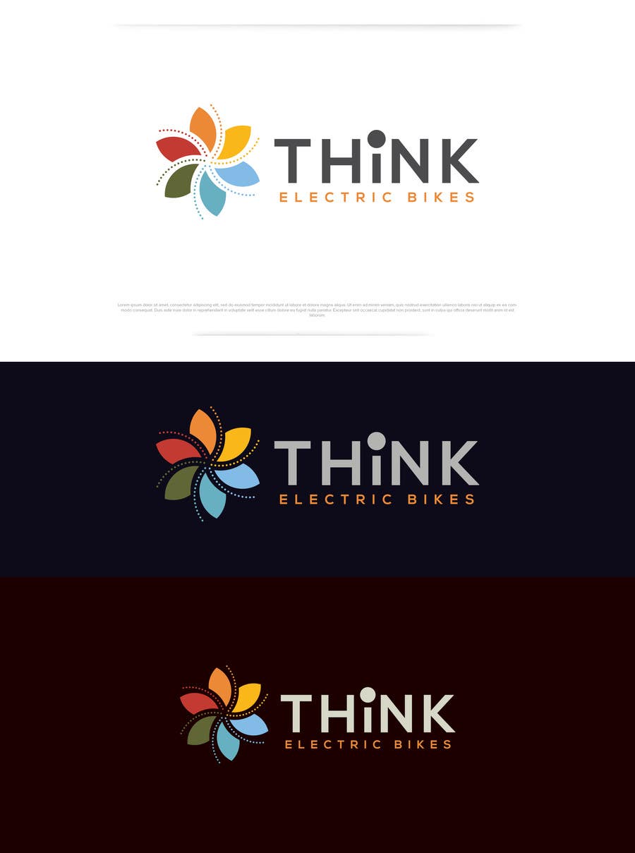
Think Electric Bikes

Here's another minimal, clean and standalone design for the logo. Kindly rate and provide feedback. Thank you.
Contest Entry #261 for                                                 Develop a Corporate Identity

Public Clarification Board

  • jonnoleonard
    Contest Holder
    • 7 years ago

    Its nice, but I think the original wheel spiral has better connotations for a bike company. The colours are good 'nature' colours though, and its pretty!

    • 7 years ago
    1. kyriene
      kyriene
      • 7 years ago

      Hi sir, many thanks for your feedback. Please do check #270 and #271. I uploaded an updated design incorporating the colors of this design as well as 2 variations. Let me know what you think. Kindly rate and provide feedback. Thank you.

      • 7 years ago