Design a New Logo for Kids/Family Band

Contest Brief

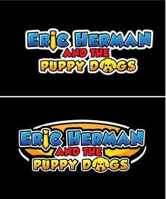
Hey there. I just changed the name of my band, and so now I need a new logo.

The band name is: ERIC HERMAN AND THE PUPPY DOGS

We are a kids/family music act, so keep that in mind. That being said, it should be cute and fun, but not too cutesy or "baby-ish" or whatever.

If you go to my website, you might get a sense of what we're about and get some ideas. http://www.EricHermanMusic.com

I don't want to give too many instructions of what you should do, though. Be creative! But maybe (maybe) something that indicates a dog/puppy as part of the design, and probably a color scheme that would work with what I usually wear (blue shirt and yellow tie).

I will give ratings to everything and try to post responses and notes to as many things as possible. I'll try hard to be specific about things, but sometimes it may not be more than "not what I'm looking for." Feel free to do something fairly rough to begin with, to see if I like the general idea... and then make it more polished later before the deadline. Please ask questions if you have any.

Have fun!

UPDATE: Please just send me one entry per idea! I keep getting an entry for the idea, and then 2-3 more entries showing that idea on a business card or window or whatever. I want to see the idea in its basic form. I can imagine its use in other ways. If you want to include pictures of that kind of thing, you can add them as extra pictures within the same entry, and I'll still be able to see them. That's fine. But please, no more of these window/paper shots as extra entries.

****VERY IMPORTANT!! Do not use any licensed imagery (Disney, Marvel, Star Wars, etc.) as part of your entry.

(Note: When I rate something, I will never give 5 stars until the final award. 3-4 stars means I'm considering it. 1-2 means there's something needed, still, or it's just not right for what I want.)

Recommended Skills

Employer Feedback

“Amazing work. Very creative and easy to work with, and would definitely hire again!”

Profile image EricHermanMusic, United States.

Public Clarification Board

  • EricHermanMusic
    Contest Holder
    • 7 years ago

    - This is your result when you let the poll choose for you.

    The poll was *never* going to be a deciding factor. We wanted to see if there was a standout winner among them (there wasn't) or if people particularly didn't like a certain one or two, in order to help us make the decision.

    - You could simply rate my entry with 1 or you should have rejected since you didn't want the same logo. You didn't say this phrase during all the contest.

    You shouldn't have assumed that I *did* want the same logo. I might have, though. Yours was very strongly considered, and was among the six finalists. It's familiarity to what I already had was a strong positive for it. Ultimately, though, one of the factors that made us go with something else was that yours wasn't as original, and the one we did choose was.

    - He says Great words about my entry then at the end he says I didn't liked the logo at all.

    I didn't say I didn't like it. I definitely did like it, which is why it made the finalists.

    • 7 years ago
  • EricHermanMusic
    Contest Holder
    • 7 years ago

    - You choose wrong.

    No. And based on your reaction here, I'm more glad not to have chosen you.

    - You didn't watch at all those 21 variations

    Yes, I did.

    - this is what happens when you know nothing from design world

    Setting the blatant insult aside, it doesn't matter what I know of design. I know what I need for my business, and what will be an effective and fun logo. You're also insulting the work of the others whose entries were submitted, by assuming that yours should have obviously been the best.

    - let your logo in the hands of your friends , again they are with no info in design world

    How do you know that? Do you know who my friends are? Many of them are artists and musicians with relevant knowledge and talent and experience in the industry I'm in. And some of them did prefer your design. Some preferred others.

    • 7 years ago
  • pratikshakawle17
    pratikshakawle17
    • 7 years ago

    @joeblackis17 ..... m not commenting just because i won.... i had so many experiences where i worked several hours on a single logo but at the end all in vain.... but that never let my spirit down...but whatever you are doing is completely wrong ..criticizing others work ..n talking about design???? oh please..who are you to judge others....

    • 7 years ago
    1. joeblackis17
      joeblackis17
      • 7 years ago

      I have nothing with you. Congratulations ! My problem is with him. He says Great words about my entry then at the end he says I didn't liked the logo at all. Anyway Good luck to all :)

      • 7 years ago
  • EricHermanMusic
    Contest Holder
    • 7 years ago

    joeblackis17 - Bad form to complain like that. I definitely did look at all of the variations (though I probably shouldn't have as they were added after the deadline). And I didn't necessarily want the same thing as my old logo. That's why I had a contest for a new one.

    • 7 years ago
  • EricHermanMusic
    Contest Holder
    • 7 years ago

    Hey, everyone. This was the hardest contest I've had here yet. I went back and forth with our band guys and families, and even posted a poll online that had a bunch of different responses. So please know that you were considered and all did very admirably. Ultimately, we're going with a variation of pratikshakawle17's design for #176 . So congrats to pratikshakawle17, and thanks so much to all of you for your great effort.

    • 7 years ago
  • EricHermanMusic
    Contest Holder
    • 7 years ago

    Hi folks. Sorry to keep you waiting, but I am going through several entries with my bandmates. There are many great ones! Thank you so much for all of your effort. I hope to have a winner decided in the next few days.

    • 7 years ago
  • RokonUddinSobuj
    RokonUddinSobuj
    • 7 years ago

    please check my entry #156#157#158#162#163#164#165#166 Thank you

    • 7 years ago
  • valentinabambi
    valentinabambi
    • 7 years ago

    #155

    • 7 years ago
  • dulhanindi
    dulhanindi
    • 7 years ago

    please check my entry 152 - thanks

    • 7 years ago
  • hafizur40
    hafizur40
    • 7 years ago

    please check #146 ,#147, #148 ,#149

    • 7 years ago
  • MdZohan1
    MdZohan1
    • 7 years ago

    please check #144 #145

    • 7 years ago
  • iionutwork
    iionutwork
    • 7 years ago

    copies
    http://www.thereliabledog.com/

    https://dribbble.com/shots/1172157-Dog-Logo

    http://eatlogos.com/health_logos/health_free_logos_download.php?eatlogos=pet_care_dog_art_inspiration_vector_logo_design&le_id=1157

    http://fr.depositphotos.com/43430807/stock-illustration-dog-head.html

    and more

    • 7 years ago
    1. EricHermanMusic
      Contest Holder
      • 7 years ago

      Thank you. Yes, I will ultimately have to reject anything with artwork that isn't original. Then again, if something is available to be purchased for use, for example from Deposit Photos, and it integrates really well into the logo design, then that could be considered.

      • 7 years ago
  • JIzone
    JIzone
    • 7 years ago

    please check # 104 # 105 # 106 # 107

    • 7 years ago
  • AdobeOmar
    AdobeOmar
    • 7 years ago

    please check #77

    • 7 years ago
  • AdobeOmar
    AdobeOmar
    • 7 years ago

    please check #75

    • 7 years ago
  • Azeze
    Azeze
    • 7 years ago

    please check #72 #73

    • 7 years ago
  • AdobeOmar
    AdobeOmar
    • 7 years ago

    please check #44 #45

    • 7 years ago
  • EricHermanMusic
    Contest Holder
    • 7 years ago

    I keep seeing pugs as the dog choice, and much as I do love them, that's probably not the look I want.

    • 7 years ago
  • EricHermanMusic
    Contest Holder
    • 7 years ago

    Can you please not send 3-4 of the same picture? Just your logo idea for now, please. I can imagine it on a business card or window or whatever. Thanks!

    • 7 years ago
    1. EricHermanMusic
      Contest Holder
      • 7 years ago

      I'm gonna give 1 star to any duplicates like that. Not meant as a reflection of your work (I'll likely give more stars to your original design), but just to kind of clear them out of the way.

      • 7 years ago
  • Webizz India
    Webizz India
    • 7 years ago

    please check my entry Entry #23

    • 7 years ago
  • AdobeOmar
    AdobeOmar
    • 7 years ago

    please check #14 #15

    • 7 years ago
  • hafizur40
    hafizur40
    • 7 years ago

    please check #17, #18

    • 7 years ago

Show more comments

How to get started with contests

  • Post your contest

    Post Your Contest Quick and easy

  • Get tons of entries

    Get Tons of Entries From around the world

  • Award the best entry

    Award the best entry Download the files - Easy!

Post a Contest Now or Join us Today!