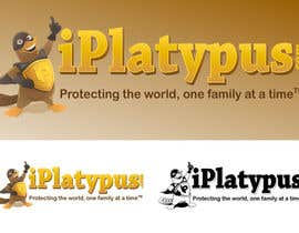
Logo Design for iPlatypus.com
- Status: Closed
- Prize: $290
- Entries Received: 4
- Winner: zhu2hui

Contest Brief
Help us create a logo and define our corporate identity. You have the opportunity to show your creativity.
Recommended Skills
Employer Feedback
“zhu2hui is an awesome illustrator and logo designer. I highly recommend their consideration.”
![]() bruchko2000, United States.
bruchko2000, United States.
Public Clarification Board
-

contestlover
- 12 years ago
Congrats to the winner man...this was super work..Ithink this should have been a 490$ contest as the logo surely looks like a 490 logo.....and taks0not.I think u deserve this too....ur logo are great too :)
- 12 years ago
View 4 more messages
-

GreenAndWhite
- 12 years ago
congrats zhu2hui. see you at the other contest. taks0not, 'tol, sayang, balato sana kung nanalo ka. next time
- 12 years ago
-

zhu2hui
- 12 years ago
THANK YOU GreenAndWhite :D
- 12 years ago
-

Fierro
- 12 years ago
Please consider #88 we can adjust the image and come up with ideas for the collateral pieces.
Thanks,
Fierro Studio.- 12 years ago
-
Fierro
- 12 years ago
Hi.
Thanks for the opportunity, The icon that we create is holding whatever de division of the company promotes in that particular moment, Also we can make it hold several objects.
Please review # 87- 12 years ago
-
Fierro
- 12 years ago
Protecting families from what or who?
- 12 years ago
-

Contest Holder - 12 years ago
We market insurance products, i.e. renters insurance, auto insurance, life insurance, etc.
- 12 years ago
-

FDsign00
- 12 years ago
Hello, we would appreciate feedback for entries #82, #83 and #84. Thank you.
- 12 years ago
-
Contest Holder - 12 years ago
I'd like to see your opinion about which design you think is the best, and why. YOU MAY NOT VOTE FOR YOUR OWN DESIGN.
- 12 years ago
-
FDsign00
- 12 years ago
Hello, please see entry#82 and #83. Thanks.
- 12 years ago
-
FDsign00
- 12 years ago
Hi, we would appreciate feedback for entries #75 and #76. Thanks
- 12 years ago
-
Contest Holder - 12 years ago
The platypus is more of a mascot/super hero. #71 and #77 are the closest yet to what we are looking for.
- 12 years ago
-

carandasher
- 12 years ago
i agree that my contest is more the mascot then logo. just the idea has appeared in my mind and i have not be able to give it up. thanks for your feedback
- 12 years ago
-

flamenco72
- 12 years ago
Hi, #64 #65 and #66 Thanks
- 12 years ago
-
Contest Holder - 12 years ago
CLARIFICATION: The superscript "TM" (trademark) goes at the end of the slogan..."Protecting the world, one family at a time." (superscript TM)
- 12 years ago
-
GreenAndWhite
- 12 years ago
#62 to coform with your latest requirement. thanks
- 12 years ago
-
GreenAndWhite
- 12 years ago
#62 to conform with your latest requirement. thanks
- 12 years ago
-
deskal
- 12 years ago
Hi!Please check #60 and #61. Thanks!
- 12 years ago
-
GreenAndWhite
- 12 years ago
'tol, no comment ka? so, it's a platypus in a suit carrying a big stick. i need to make one with a bigger stick then :D
- 12 years ago
-
GreenAndWhite
- 12 years ago
wow that was quick #55. you got rid of the stick real fast
- 12 years ago
-

taks0not
- 12 years ago
haha! thank you for keen observation my fellow GreenAndWhite. Youve got an awesome entry. Ayus tol ah :D
- 12 years ago
-

sastromunix
- 12 years ago
see #47
- 12 years ago
-
flamenco72
- 12 years ago
News Models : #44 and #45 Thanks
- 12 years ago
-

manikmoon
- 12 years ago
Niiiiiice!
- 12 years ago
-
flamenco72
- 12 years ago
Re, #43 Thanks
- 12 years ago
-
Contest Holder - 12 years ago
Thank you for all the great ideas. Here are some of the graphics details to keep in mind. I prefer the following characteristics...
1) I prefer "iPlatypus.com" where it's a lowercase "i", and Uppercase "P", lowercase "latypus", and the ".com" vertical at the end. #24 has done a nice job with the "printing" portion of the logo producing an upscale, textured look.
2) I prefer the slogan, "Protecting the world, one family at a time." with the "TM" trademark symbol at the end.
3) I prefer the slogan underneath in most cases. However, #37 is fine the way it's incorporated.
4) I need the logo to look good in color with an equally good black and white version.- 12 years ago
-
Contest Holder - 12 years ago
5) The mascot needs to play a significant role in the logo, as in #33, #34, #37, and #40. These are the best overall mascot designs so far in the contest. #24 has the best "wording design" portion of the logo design. The "perfect" design will incorporate both aspects, character, and typeface.
6) The mascot should be strong, brave, and confident, NOT angry, NOT too happy. Think strong, silent, superhero.
7) Logo should have a 3D, textured look.
8) Feel free to experiment with different color themes.- 12 years ago
-
GreenAndWhite
- 12 years ago
please feedback on #42. portraying "not on my watch..." attitude
- 12 years ago
-
flamenco72
- 12 years ago
Hello, #41 Thanks
- 12 years ago
-
Stemate1
- 12 years ago
Hy!Please view #39.Thank you!
- 12 years ago
-
Contest Holder - 12 years ago
Perhaps you could make the platypus image more like a mascot, or corporate spokesman. I'm looking for something a little more upscale, sophisticated, and three dimensional. Designs #33, #34, #37 and #40, are the closest so far.
- 12 years ago
-
zhu2hui
- 12 years ago
Hi please check #33, thank you..
- 12 years ago
-
richhwalsh
- 12 years ago
please look at #21
- 12 years ago
-
Contest Holder - 12 years ago
It's a good start. I'm looking for something a little more upscale, sophisticated, and three dimensional. Design #2 is the closest so far. Perhaps less cartoonish, and more sophistication.
- 12 years ago
-
manikmoon
- 12 years ago
Thanks for the feedback! I'm glad you like what I've done so far!
- 12 years ago
-

smitsmit
- 12 years ago
hi pls feedback #5 #15 thank
- 12 years ago
-
Contest Holder - 12 years ago
#5 is a good start. I'm looking for something a little more upscale, sophisticated, and three dimensional. Design #2 is the closest so far. Perhaps incorporate our slogan as others have.
- 12 years ago
-
Contest Holder - 12 years ago
Or include a platypus instead of a "clip art" feel.
- 12 years ago
-
flamenco72
- 12 years ago
Hi, #24 and #25 Thanks
- 12 years ago
-
Contest Holder - 12 years ago
I like the type and layout. Perhaps you could make the platypus image more like a mascot, or corporate spokesman. It's a good start. I'm looking for something a little more upscale, sophisticated, and three dimensional. Design #2 is the closest so far.
- 12 years ago
-

oscarmauricio
- 12 years ago
Hello Contest Holder. Please, give some feedback on my design
- #26- 12 years ago
-
Contest Holder - 12 years ago
It's a good start. I'm looking for something a little more upscale, sophisticated, and three dimensional. Design #2 is the closest so far.
- 12 years ago
-
Contest Holder - 12 years ago
Please remember, designs must be original and MUST NOT infringe upon any trademark or copyright.
- 12 years ago
-
Contest Holder - 12 years ago
I've already rejected them, but thank you for agreeing with my concerns.
I'd like you to consider designing a logo with an original character.- 12 years ago
-
Contest Holder - 12 years ago
I will continue to reject any design with Disney characters, or any other "non-original" characters.
- 12 years ago
How to get started with contests
-

Post Your Contest Quick and easy
-

Get Tons of Entries From around the world
-

Award the best entry Download the files - Easy!