update logo and modernize

  • Status: Closed
  • Prize: £10
  • Entries Received: 130
  • Winner: atifraja3595

Contest Brief

EDIT - Makes sure entries say essential recycling - i need the word events removing - had 4 enries with the word event still there

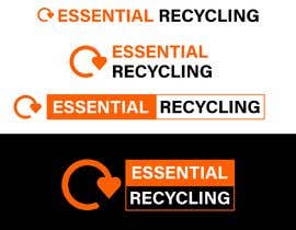
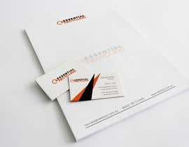
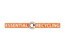
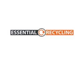
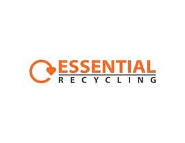
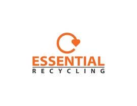
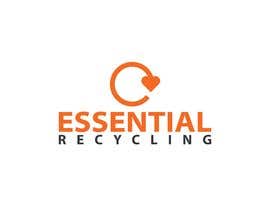
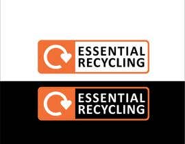
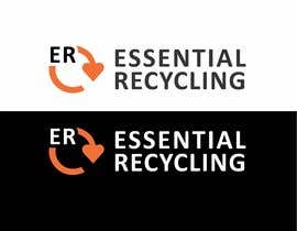
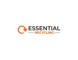
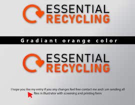
i have a logo for my company - essential event recycling - i had this done some time ago and i want it changing to just say - essential recycling - and maybe making a big crisper and fresher - i like the colours orange and black.

i would like a banner, a letter head and a nice square one for buiness cards so high def. i would also like a small one that doesn't say all the words so maybe just ER and the Logo?

thanks

Recommended Skills

Employer Feedback

“Muhammad had read the brief and did the work well! replied to my messages quickly and did the work to a high standard. excellent freelancer A+++++”

Profile image chrisnewton01, United Kingdom.

Top entries from this contest

View More Entries

Public Clarification Board

  • akhilsharma48224
    akhilsharma48224
    • 3 years ago

    Sir please check #69 #70

    • 3 years ago
  • chrisnewton01
    Contest Holder
    • 3 years ago

    to many to comment on but i've rater all hope that helps.

    • 3 years ago
    1. smomarsabbir1920
      smomarsabbir1920
      • 3 years ago

      If you have any other needs in the logo or want to add more, tell me, I will try. Thanks.

      Regards,
      smomarsabbir1920

      • 3 years ago
    2. akhilsharma48224
      akhilsharma48224
      • 3 years ago

      Sir please check #69 or #70

      • 3 years ago
  • Saidurbinbasher
    Saidurbinbasher
    • 3 years ago

    Please Feedback My Inbox.

    • 3 years ago
  • smomarsabbir1920
    smomarsabbir1920
    • 3 years ago

    Please cheek #133 #134 #135

    • 3 years ago
  • cmzsoftware
    cmzsoftware
    • 3 years ago

    #131

    • 3 years ago
  • cmzsoftware
    cmzsoftware
    • 3 years ago

    #130

    • 3 years ago
  • cmzsoftware
    cmzsoftware
    • 3 years ago

    #128 , #129

    • 3 years ago
  • cmzsoftware
    cmzsoftware
    • 3 years ago

    #127

    • 3 years ago
  • chrisnewton01
    Contest Holder
    • 3 years ago

    74 i like the er in the arrow as a seperae logo. its not quite what i'm after but close needs to meld togehter better

    • 3 years ago
  • Usmansaleem7456
    Usmansaleem7456
    • 3 years ago

    please check #116 #117

    • 3 years ago
  • smomarsabbir1920
    smomarsabbir1920
    • 3 years ago

    Please cheek #113

    • 3 years ago
  • akhilsharma48224
    akhilsharma48224
    • 3 years ago

    Sir please check #69 or #70

    • 3 years ago
  • Humayandesign
    Humayandesign
    • 3 years ago

    Please check #112

    • 3 years ago
  • atifraja3595
    atifraja3595
    • 3 years ago

    please see my new design #111

    • 3 years ago
  • shrobin16
    shrobin16
    • 3 years ago

    Please check #100 , Thanks

    • 3 years ago
  • alaminislamonti
    alaminislamonti
    • 3 years ago

    #95

    • 3 years ago
  • Usmansaleem7456
    Usmansaleem7456
    • 3 years ago

    its more updated design i hope you like #90 #91

    • 3 years ago
  • cmzsoftware
    cmzsoftware
    • 3 years ago

    #92

    • 3 years ago
  • cmzsoftware
    cmzsoftware
    • 3 years ago

    #87

    • 3 years ago
  • cmzsoftware
    cmzsoftware
    • 3 years ago

    Please check #84 , #85

    • 3 years ago
  • bdsarajit499
    bdsarajit499
    • 3 years ago

    #82

    • 3 years ago
  • bdsarajit499
    bdsarajit499
    • 3 years ago

    SIR CHECK #77

    • 3 years ago
  • chrisnewton01
    Contest Holder
    • 3 years ago

    72 73, i like but is a bit like an old gameeoby blocky and retro, i wanna look mondern and proffesional

    • 3 years ago
  • chrisnewton01
    Contest Holder
    • 3 years ago

    71 i sort of like the line and the centred as it put top writing and bottom together well but i doubt we will use it. i'm unsure why

    • 3 years ago
  • akhilsharma48224
    akhilsharma48224
    • 3 years ago

    Sir please check #69 or #70

    • 3 years ago
  • chrisnewton01
    Contest Holder
    • 3 years ago

    some good simple ones people who are trying to do something different i like but your not hitting the mark 61 and 64 have something 41 and 7 are winning 56 i like the letter e with the arrow on it so worth pursuing

    • 3 years ago
    1. shrikantsshinde
      shrikantsshinde
      • 3 years ago

      https://overusedlogodesigns.wordpress.com/2018/06/24/overused-logo-designs/

      • 3 years ago
  • hpradeee
    hpradeee
    • 3 years ago

    please check #27

    • 3 years ago
    1. chrisnewton01
      Contest Holder
      • 3 years ago

      don't like the arrow like that and don't like the font

      • 3 years ago
  • sabbir17c6
    sabbir17c6
    • 3 years ago

    Dear CH, #guaranteed please ...

    • 3 years ago
    1. chrisnewton01
      Contest Holder
      • 3 years ago

      i don't think i need to as i'm picking a winner defo

      • 3 years ago
  • Usmansaleem7456
    Usmansaleem7456
    • 3 years ago

    hi contest holder please check my entries ihope you like #37 #29

    • 3 years ago
    1. chrisnewton01
      Contest Holder
      • 3 years ago

      yes 37 is good, may be presentaion style doesn't do it justice

      • 3 years ago
  • atifraja3595
    atifraja3595
    • 3 years ago

    please see enter #41

    • 3 years ago
    1. chrisnewton01
      Contest Holder
      • 3 years ago

      yes excellent, not trying to reinvent the wheel and did what i asked. possilby if you could do also just leter E and R as one you may win

      • 3 years ago
  • fizzee2009
    fizzee2009
    • 3 years ago

    pls check 43

    • 3 years ago
    1. chrisnewton01
      Contest Holder
      • 3 years ago

      no sorry bad colours and design

      • 3 years ago
  • ashrafulislam211
    ashrafulislam211
    • 3 years ago

    Sir, please check my entry #45 , #48

    • 3 years ago
    1. chrisnewton01
      Contest Holder
      • 3 years ago

      i like that you tried something different but i have to be honest i didn't like it. to much like a bank and not a reyccling company

      • 3 years ago
  • akhilsharma48224
    akhilsharma48224
    • 3 years ago

    Sir please check #55

    • 3 years ago
    1. chrisnewton01
      Contest Holder
      • 3 years ago

      no sorry just poor, wrong oragne and wrong recycling symbol

      • 3 years ago
  • alaminislamonti
    alaminislamonti
    • 3 years ago

    #57

    • 3 years ago
    1. chrisnewton01
      Contest Holder
      • 3 years ago

      is acutally ok but is the wrong orange and the arrow being split colout is ok but a bit harsh and looks a bit odd

      • 3 years ago
  • cmzsoftware
    cmzsoftware
    • 3 years ago

    Please check #60 , #61 , #62 , #63 , #64 , #65 , #66 . I hope you will like one of them.

    • 3 years ago
    1. chrisnewton01
      Contest Holder
      • 3 years ago

      64 61have something but need not quite right maybe combined with the swish

      • 3 years ago
  • ashrafulislam211
    ashrafulislam211
    • 3 years ago

    Sir, please check my entry #48

    • 3 years ago
  • ashrafulislam211
    ashrafulislam211
    • 3 years ago

    Sir, please check my entry #45

    • 3 years ago
  • chrisnewton01
    Contest Holder
    • 3 years ago

    i gave all the ones with the wrong words one star

    • 3 years ago

Show more comments

How to get started with contests

  • Post your contest

    Post Your Contest Quick and easy

  • Get tons of entries

    Get Tons of Entries From around the world

  • Award the best entry

    Award the best entry Download the files - Easy!

Post a Contest Now or Join us Today!