Freelancer: Mechaion
Share:
Report Entry

SB Study 2

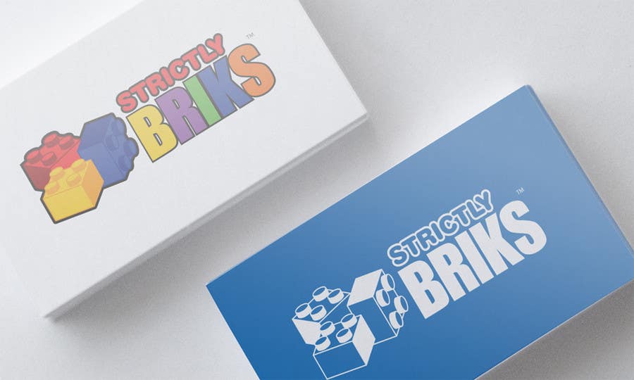
n and variation of my first design. Changed the fonts into a more child friendly. Strokes was added for the outline. The different color of the word "BRIKS" represent the colors of your plates/items. Thank you.
Contest Entry #98 for                                                 Design a Logo for Strictly Briks

Public Clarification Board

  • strictlybriks
    Contest Holder
    • 9 years ago

    This is looking better, the two-tone looks really nice. From this logo and others we have seen, 3 colors seem to be the max.

    • 9 years ago
    1. strictlybriks
      Contest Holder
      • 9 years ago

      Another interesting touch to add would be the i from 114 with the peg on it.

      • 9 years ago
    2. Mechaion
      Mechaion
      • 9 years ago

      Ok sir. Will combine that idea too.

      • 9 years ago