Freelancer: fairurban
Share:
Report Entry

tri-fold resume

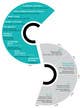
This is an A3 / A4 tri-fold resume design. I've gone with a minimalistic approach with clean, crisp, professional look. The neat, sequential flow of of text with lots of white space promotes ease of reading. On the bottom of the profile page, under the label "featured clients" is where you can insert your client logos. To compliment to 3 coloured theme I'd suggest converting logos to grayscale. This is just a proof of concept, refinements and changes can be made if you like the look of this. The text on the front cover, where it says "Hi, I'm a videographer", can be replaced with a short, enticing sentence of your choice. Another concept that I have in mind is a more graphical approach, using the "S" from your first name as the "journey" of your career history. Please see final image for rough proof of concept. Graphically it looks more compelling, however, the information is a bit difficult to process. Let me know your thoughts

Contest Entry #29 for                                                 I need some Graphic Design for my printed Videographer CV

Public Clarification Board

  • fairurban
    fairurban
    • 9 years ago

    Hi there, just letting you know that I have made changes to the design and sent you the details on a private message board. Let me know if you can locate the messgaes. Regards, Jodie

    • 9 years ago
  • fairurban
    fairurban
    • 9 years ago

    Hi Stuart, hope you had an awesome Easter break! Thanks for your rating, I'm really glad you like the approach. I will process your feedback and send through something tonight. Should I have any questions along the way, I will send you a private message.

    • 9 years ago
  • Thebigedge82
    Contest Holder
    • 9 years ago

    PS, this will make more sense if you read it from the last post first and work backwards :)

    • 9 years ago
  • Thebigedge82
    Contest Holder
    • 9 years ago

    More generally, the layout is great and I love what you've come up with. I'm very keen for the graphical elements (logos, equipment images) to becomes more prominent, because as this is essentially a sales document, I want it to be immediately clear that I have worked for reputable companies and that I own and operate this equipment. Thanks so much, look forward to seeing the next version!

    • 9 years ago
  • Thebigedge82
    Contest Holder
    • 9 years ago

    Text additions: - under my name and video solutions specialist, could you add my site www.chuckedgeworth.com, - to 'creative projects' could you add 2015 Melbourne Film Festival entrant "The Drink".

    • 9 years ago
  • Thebigedge82
    Contest Holder
    • 9 years ago

    The logos showing my featured clients is very important as well. Can you include these? They just need to be a simple single colour version of the company logo which you could find from a google search. I would like to see section take up half of one of the tri-folds. Even if that meant condensing the work experience time-line, I would be happy with that.

    • 9 years ago
  • Thebigedge82
    Contest Holder
    • 9 years ago

    images under the skills section need to be more prominent. Perhaps instead of a single line of 6 images, 2 lines of 3. Also, regarding the Camera equipment in particular, it needs to be clear that I own it, not just that I know how to operate it. Clear labelling of the equipment (FS7 & 5DIII for the cameras) is very important.

    • 9 years ago
  • Thebigedge82
    Contest Holder
    • 9 years ago

    Hi, thanks for your entry, I really like it. I feel if we can refine a few elements it will be perfect. So a few thoughts:

    • 9 years ago

Show more comments Processing...