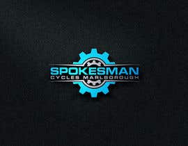
Re-Design Logo
- Status: Closed
- Prize: $100
- Entries Received: 14
- Winner: mdshamimhosen86

Contest Brief
Spokesman Cycles Marlborough is looking for a new logo.
The name is widely known in the region Marlborough NZ, as it has been the go to place for > 30 years for bicycles and mobility aids, but it needs to step into this century with a new logo, look and feel.
The shop offers a wide range of bicycles, full maintenance servicing by the mechanics plus it offers mobility scooter/servicing for the elderly.
See attached the old logo in desperate need of re-designing.
What are we looking for:
Colour: max. of 2 colours, black and white ok, preference is dark blue as the shop has these colours throughout. Would save us the hassle of repainting. Would like to have the file in reverted colours as well, so I can use this online against a different background colours and also for printing stickers etc. etc.
Shape: similar-ish to the old logo for the elderly folks, NO BICYCLE in LOGO
Words: Just Spokesman Cycles (leave the Marlborough part out of it, or as a subheader or something) the old logo attached shows the brand Avanti, but this should NOT be on the new logo!
Looking forward to some creative entries ;-)
Recommended Skills
Employer Feedback
“@mdshamimhosen86 won the contest on 26 July 2017”
![]() MDijkstra10, New Zealand.
MDijkstra10, New Zealand.
Public Clarification Board
-

MrNegi314
- 6 years ago
hello sir
please dont hesitate to send me a message if you want something to change sir..- 6 years ago
-

AthinaAnjum
- 6 years ago
Please check #153
- 6 years ago
-

pritomkundu370
- 6 years ago
Sir, please check #147#148#149
- 6 years ago
-
pritomkundu370
- 6 years ago
Sir, please check #144#143#142
- 6 years ago
-

Contest Holder - 6 years ago
Hi Everybody, LOVE the LOGO's! Wow what a talent out there..sheesh! I am off to bed, tomorrow another busy day now we decided to change this bicycle shop into spokesman! If I can suggest something it would be to add spokes instead of cog (gear) into the logo? I wonder how that would look......Or am I getting to greedy ;-) Absolutely Awesome so far!
- 6 years ago
-

mariavazieva
- 6 years ago
These are all copied from the web ))) nice talent... Cheater talent)) Open google and look for "bicycle logo", "bicycle detail logo" etc https://www.google.it/search?q=bicycle+logo&source=lnms&tbm=isch&sa=X&ved=0ahUKEwjU2dHbrp3VAhUIVRoKHbafDkkQ_AUIBigB&biw=1366&bih=638#tbm=isch&q=bicycle+gear+logo... Do not waste your money.
- 6 years ago
-
mariavazieva
- 6 years ago
https://goo.gl/V2Ddmv
- 6 years ago
-
rumel2630
- 6 years ago
Sir, please check#103#104
- 6 years ago
-
rumel2630
- 6 years ago
Sir, please check#102
- 6 years ago
-
TimingGears
- 6 years ago
Please check #98 #99
- 6 years ago
-
designsecret17
- 6 years ago
CHECK #96 #97
- 6 years ago
-

toplanc
- 6 years ago
kindly check #92 #93 #94 #95
- 6 years ago
-
Contest Holder - 6 years ago
Ok, going to do some re-rating as had a second pair of eyes look at the entries ;-)
- 6 years ago
View 1 more message
-
Contest Holder - 6 years ago
Hi MrNegi314, I like your logo. But what I don't understand is why everybody uses a COG (gear) in the logo while the name refers to SPOKES?
- 6 years ago
-
MrNegi314
- 6 years ago
thank you sir for feedback
i will fix it soon
thanks again- 6 years ago
-

Leoserdena
- 6 years ago
Entry #66 of 66 new
- 6 years ago
-
Leoserdena
- 6 years ago
Leoserdena
Entry #65 of 66 new- 6 years ago
-
Leoserdena
- 6 years ago
Entry #64 of 64 new
- 6 years ago
-
Leoserdena
- 6 years ago
Entry #63
- 6 years ago
-
Leoserdena
- 6 years ago
Entry #60 of 60
- 6 years ago
-
saidurafridi7
- 6 years ago
Please check entry#55#56#57#58#59.
- 6 years ago
-
AthinaAnjum
- 6 years ago
Sir, please check #52 #53 #54
- 6 years ago
-

fighter3
- 6 years ago
check #19 #20
- 6 years ago
-
Contest Holder - 6 years ago
I think we should make spokesman 1 word without a space in between
- 6 years ago
-
fighter3
- 6 years ago
thank you, do you like typography logo?
- 6 years ago
-

artlogo1
- 6 years ago
please check #14#15
- 6 years ago
-
Contest Holder - 6 years ago
Hi Artlogo, potentially the bike shape a bit different?
- 6 years ago
-

fajarramadhan389
- 6 years ago
hi sir, thanks for your feedback please give the feedback for private,,So that the resulting idea can not be imitated. thanks
- 6 years ago
-
Contest Holder - 6 years ago
Hi Marael10, WOW you are fast in editing and submitting the logos..WOW. Could you change the bicycle out of the logo? I do like the grey and black contrast ;-)
- 6 years ago
-
Contest Holder - 6 years ago
Hi Marael10, Thanks to the first entry I decided I would like the logo to NOT contain a bicycle, as we sell trikes, cargo bikes and mobility scooters
- 6 years ago
-
Contest Holder - 6 years ago
Hi Fajarramadhan389, I think I like it without the box around it better and with the angled lines underneath ;-)
- 6 years ago
-
Contest Holder - 6 years ago
Hi Jarrett, perhaps change the cog into spokes?
- 6 years ago
-
Contest Holder - 6 years ago
Hi Fajarramadhan389, really like the look of the logo, nice clean and sleek
- 6 years ago
-
Contest Holder - 6 years ago
We sell more then just push bikes, as we have a wide range of e-bikes, cargo bikes, mobility scooters. But thank you for the entry as it helps to decide which way to go!
- 6 years ago
-
Contest Holder - 6 years ago
Hi Fighter3, I like the logo and the colour, but now I see it I am positive I would like the logo to NOT contain a bicycle but ONLY the name ;-)
- 6 years ago
How to get started with contests
-

Post Your Contest Quick and easy
-

Get Tons of Entries From around the world
-

Award the best entry Download the files - Easy!