mstsurminakter
Bangladesh


Have a look at our website editor at poster.myholidaymap.com. We are looking for someone to re-imagine the whole experience by keeping luxury and ease of use in mind. The UX of the editor should reflect uniqueness and class. Commercial fonts, icon set, colours and textures are welcome and will be paid separately (Subject to complete price for the whole gig).
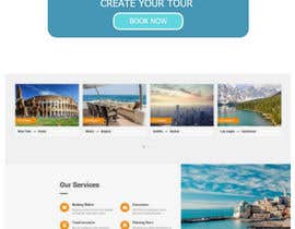
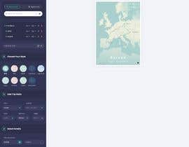
We would suggest experiencing the current user experience of an editor by entering up to 25 destinations with air, car options selected. This will give you a better idea. As our users can enter up to 50 destinations.
In new ui/ux user can enter a manual route for a water cruise, like a brazier curve.
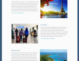
Some other options to add and show user uploaded photo, import route from google, add icons like Eiffel tower for france.
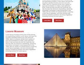
Note: Once you enter the destination name, few other options come up, like rename, rotate, change the font size, delete, re-order. It's up to you to decide, how and where these options should appear and operated.
Another part of the new UI/UX is to ensure that the user can do a travel book, with multiple posters, He should also be able to order the same poster in other designs, by having some option to preview.
We would rather encourage the designs that push the limit of our coding team so we can have a perfect UI/UX
“Great Job Kaprion. We got the unique UI/UX for our webapp. ”
![]() SystematicBytes, Australia.
SystematicBytes, Australia.

Post Your Contest Quick and easy

Get Tons of Entries From around the world

Award the best entry Download the files - Easy!
