Logo design
- Status: Closed
- Prize: $150
- Entries Received: 32
- Winner: taseenabc
Contest Brief
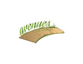
We really like the idea of a sidewalk or path as part of our logo, no icons with people in them. We'd like a logo that is earthy and warm. We want our practice to look friendly and welcoming, almost playful. We do not want a heavy or corporate looking logo. We serve men, women and children of various economic and educational backgrounds.
We are a group of independent therapists joined to support people in finding hope and resilience in the face of life’s obstacles. We are committed to supporting people in finding solutions to dealing with life’s challenges, regardless of their ability to pay.
Our name is Avenues for Change. We are thinking of blue and green tones for our logo, maybe a light tan?
Recommended Skills
Employer Feedback
“Apu was creative, polite, prompt, patient and professional throughout the process!”
![]() ckellyks, United States.
ckellyks, United States.
Top entries from this contest
-
taseenabc Bangladesh
-
taseenabc Bangladesh
-
taseenabc Bangladesh
-
taseenabc Bangladesh
-
taseenabc Bangladesh
-
taseenabc Bangladesh
-
taseenabc Bangladesh
-
Nahinhasan Bangladesh
-
Nahinhasan Bangladesh
-
herobdx Bangladesh
-
herobdx Bangladesh
-
herobdx Bangladesh
-
graphicground Bangladesh
-
ShadowCast21 India
-
pavelmaster02 Bangladesh
-
pavelmaster02 Bangladesh
Public Clarification Board
How to get started with contests
-

Post Your Contest Quick and easy
-

Get Tons of Entries From around the world
-

Award the best entry Download the files - Easy!

