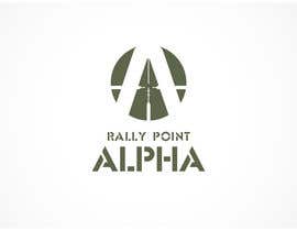
Logo Design for Rally Point Alpha
- Status: Closed
- Prize: $490
- Entries Received: 59
- Winner: Habitus

Contest Brief
Hosts Tactical Firearms Competitions and sells Tactical Gear.
Recommended Skills
Public Clarification Board
-
Michael45
- 12 years ago
Congats
- 12 years ago
-

Zubairthreaded
- 12 years ago
Congrats Habitus :p
- 12 years ago
-

Habitus
- 12 years ago
Thanks!
- 12 years ago
-
NEVIKSIOSANCAN
- 12 years ago
where is the winning design?
- 12 years ago
-

elegantdesigners
- 12 years ago
http://www.freelancer.com/contest/Logo-Design-for-India-Ports-6071.html
Winner copied link:
http://www.inforwarding.com/message.asp?message=50079- 12 years ago
View 2 more messages
-

ContestDesigner
- 12 years ago
Sometimes are just to let the contest holders know about designers that win contests by copying from another sites, by this way, contest holder can be aware about this.
- 12 years ago
-

Contest Holder - 12 years ago
Odd, there is nothing at that site that resembles the choice I made. Peculiar place this is. Thank you for the explanation though.
- 12 years ago
-

picxel2010
- 12 years ago
feedback please #85 #86
- 12 years ago
-
graphicsavvy
- 12 years ago
- 12 years ago
-

livialivialivia
- 12 years ago
A few more options for you #148 #149 #150
- 12 years ago
-
livialivialivia
- 12 years ago
nevermind those, I've withdrawn them and posted new correct ones.
- 12 years ago
-
cynt1001
- 12 years ago
Please provide feedback for #151, #152 and #153
- 12 years ago
-
livialivialivia
- 12 years ago
Please feedback #145 #146 and #147 so I can improve if needed. :)
- 12 years ago
-
ContestDesigner
- 12 years ago
Please, feedback my entry #143, thanks in advance!
- 12 years ago
-
tomaszziolkowski
- 12 years ago
Hello, and thank You in advance for feedback.
Regards
Thomas- 12 years ago
-

mgleaf
- 12 years ago
#140
- 12 years ago
-

handsy
- 12 years ago
rate #139
- 12 years ago
-

AlveenaK
- 12 years ago
Please view #137 and #138 . Both will also perform well as embroidered badges specially 138. Your feedback shall polish the concept. Thanks.
- 12 years ago
-

Glock23
- 12 years ago
Comments for #115 #116 #117 #118 pls. Thanks.
- 12 years ago
-
picxel2010
- 12 years ago
feedback please #85 #86
- 12 years ago
-

botaflorentin
- 12 years ago
Are #67 and #69 on the right track? They can be simplified if necessary.
- 12 years ago
-
Contest Holder - 12 years ago
I enjoy both 67 & 69 btu not sure how well they would transfer into an embrodered design. Also I'm seeking something with more of a Branding Look/Feel to it. #75 I don't care for at all
- 12 years ago
-
botaflorentin
- 12 years ago
Thank you for your feedback. Regarding the embroidered design, the shadows will be removed and there is no reason why it couldn't be digitized. An example of the depth level can be seen here: http://www.tshirt4u.co.uk/tronseal/images/uploads/patches/21012010244.jpg . Besides that, if you already have 5 star choices it means this is not in the right direction and maybe I'll find other design ideas. Regards
- 12 years ago
-

laureen08
- 12 years ago
Hello sir, please rate #103
- 12 years ago
-

mustakimmasum
- 12 years ago
Hello sir,
Please check entry #102
I believe you'll love it- 12 years ago
-

steamrocket
- 12 years ago
pls check #91 #92 #93 #94 #95
- 12 years ago
-
picxel2010
- 12 years ago
look at and rate #85 #86
- 12 years ago
-

dragonarm
- 12 years ago
please rate and comment on #72 and #73
include details about the font , its color, quality and a vague idea of what you want...
just so that I can come up with ideas you would like!!!
also can you tell me what the maximum rating you have given to a design just so that I know where I stand among them?- 12 years ago
-
Contest Holder - 12 years ago
I don't like the lower case A as part of the design. I'm looking for something will allow an easier branding/trademark
The max rating I've given to date is 5 stars. 3 submissions have rated 5 stars and 4 submissions have rated 4 stars- 12 years ago
-
dragonarm
- 12 years ago
it is the greek alpha symbol
- 12 years ago
-
handsy
- 12 years ago
plz give feedback for d #81 ...i hope u like it
- 12 years ago
-
BevUK
- 12 years ago
would you please leave feedback for #59 and #79 so I have idea on what your looking for thank you Beverley
- 12 years ago
-
BevUK
- 12 years ago
sorry also #80 if you dont mind thanks
- 12 years ago
-
Zubairthreaded
- 12 years ago
Review #35 , #36
Thanks- 12 years ago
-
Contest Holder - 12 years ago
Not crazy about either one of these
- 12 years ago
-

vinayvijayan
- 12 years ago
Hi,
Please check #78
Thanks- 12 years ago
-

lycheedzine
- 12 years ago
#63 thanks
- 12 years ago
-
Habitus
- 12 years ago
Hi! Please feedback #47 , #48 , #49 . Thanks!
- 12 years ago
-
BevUK
- 12 years ago
please check out #59 thank you
- 12 years ago
-
dragonarm
- 12 years ago
please rate #46
note: this is just a basic concept i can enhance it to your requirements and also i made it simple since you will also use it as a embroidery .- 12 years ago
-
Contest Holder - 12 years ago
Although I like this design it too closely resembles the logo of Rally Point Chapel http://rallypointchapel.com/about-us/
- 12 years ago
-
dragonarm
- 12 years ago
do you like what i have done with the 'L'?
and just to know where I stand could you tell me the maximum rating you have given?- 12 years ago
-

EzeldeenMustafa
- 12 years ago
Hi! Please feedback.. #31
- 12 years ago
-
dragonarm
- 12 years ago
please do rate #45
- 12 years ago
-
Contest Holder - 12 years ago
This design was rejected. I'm not enthusiastic about using a weapon on the logo as the industry is constanstly evolving.
- 12 years ago
-

designanswer
- 12 years ago
- 12 years ago
-
Contest Holder - 12 years ago
Like this design
- 12 years ago
-
JoeMista
- 12 years ago
#55, Thanx
- 12 years ago
How to get started with contests
-

Post Your Contest Quick and easy
-

Get Tons of Entries From around the world
-

Award the best entry Download the files - Easy!