joy2016
Bangladesh

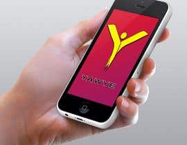
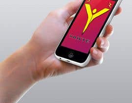
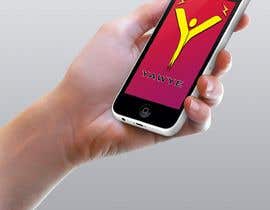
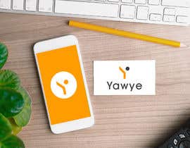
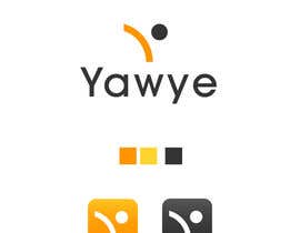
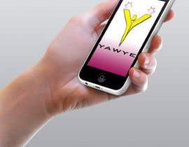
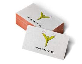
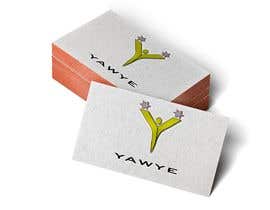
Hi, my name is Mr. Beastie. My website is www.yawye.org. Don't pay any attention to the landing page; it's not at all meaningful, of our design aesthetic. However, the second follow-on page will describe our interactive journalism platform. We will be targeting millennial workers 21-35, and to start in the U.S., Our slogan is "Empathy Is The New Intelligence." We are a b2b2c new media and sentiment data company meaning the content we produce will be licensed to major companies, but the users will be their next-gen workers. Our media will be interactive with users able to click "emoticons" which reside on top of the video and allow us to register their immediate feedback. The name of the company is "Yawye" We are very interested in the "Y" as a dominant part of the logo design. Most of the use case will be in a mobile environment...so think"button" size; like an "app" on the phone in a mobile environment; and in that context, we are liking a dominant "Y" with the name "Yawye" separately. Our slogan "Empathy Is The New Intelligence" will not always appear with the Yawye logo, therefore, it would be useful to see the logo with and without the slogan. The company color palette we have experimented with is an "electric modern yellow" for the "Y" and then two contrasting shades of gray (Charcoal and a lighter shade of contrast.). However, this is not mandatory rather just what we have seen so far. In our design experiments, that color palette creates a "zen" feeling which could be good but also is clearly lacking energy. The "Y" for Yawye = "why" which is strategic to our brand and our journalistic stories. That is the reason we believe a dominant logo should feature a "Y" as visually iconic. That said, simplicity is always good especially in small designs like this for a primarily mobile-first environment.The approaches work for our digital use cases + when it's tiny (think a button on an iPhone) kind of like the size of an app...but not exactly. One more thought: in the energy context: something shooting out of the top of the "Y"? on both extensions....when we animate the final logo--a thought we have is that the top of the "Y" will shoot out to expose the "titles" of our stories...the first one, FYI, is the "student debt epidemic".
“Jayanto is a very creative and very professional graphic designer. He is first class in every manner. Highly recommend.”
![]() mrbeastie1, United States.
mrbeastie1, United States.


Post Your Contest Quick and easy

Get Tons of Entries From around the world

Award the best entry Download the files - Easy!

