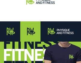
Modernise our logo

  • Status: Closed
  • Prize: $190
  • Entries Received: 37
  • Winner: R212D

Contest Brief

I need to modernise our logo. You can see it’s starting to look a bit dated!

There’s only a couple of requirements:

- The PW (with the ring around it) needs to stay. That's the bit that everyone in our area will recognise
- As well as print/online medium, it will also be used in our studio where it might be cut out of silver and put on a hard-wood background (for example), so it needs to function as both coloured and single colour
- Our company colours are lime-green, black, and white so they need to remain

Other than that, it just needs to be brought up to date.

A little about our brand:

- We help affluent (mostly) women aged 35-55 drop fat and transform their bodies by coaching them in our personal training and transformation studio
- We are a very high-end studio, so, although people do come in to work out, think along the lines of luxury spa in our vibe rather than commercial gym in terms of who the logo should talk to

If you have any other questions, then let me know.

Recommended Skills

Employer Feedback

“Excellent. Fantastic English, and worked with us to get an already excellent concept just perfect. Wouldn't hesitate to hire again.”

Profile image arpentsl, United Kingdom.

Public Clarification Board

  • R212D
    R212D
    • 5 years ago

    Check Out #87

    • 5 years ago
  • arpentsl
    Contest Holder
    • 5 years ago

    Thank you so much for all your entries so far.

    Let me just quickly re-iterate something from the job description which should save you a lot of time and wasted effort:

    * The PW (with the ring around it) needs to stay. That's the bit that everyone in our area will recognise *

    A lot are being rejected simply because this is being missed.

    I'm talking about this part of our logo:

    https://pwfit.uk/icon

    This is the most important part of our logo.

    If you choose to change it, rather than use it as is, I have no problem with this, BUT it needs to be recognisable.

    Like the McDonalds "M", for example.

    Another way to look at it if you choose to modify it is this: Imagine if you knew our brand already, and you were walking down the street, and just saw a sign with that icon and no text from a distance. With your modifications, would you still instantly recognise our brand?

    • 5 years ago
    1. think2dzn
      think2dzn
      • 5 years ago

      THNX, MY ALL ENTRIES HAS FOLLOWED YOUR REQUIREMENTS, please check all & let me know for any modification. we are very open to modification and your suggestion. thanks!

      • 5 years ago
  • think2dzn
    think2dzn
    • 5 years ago

    #34#35#36#37#38#39#41 please check all my entries & let me know for any modification. we are very open to modification and your suggestion. thanks!

    • 5 years ago
  • DesignLover470
    DesignLover470
    • 5 years ago

    please check entry #26 #30 #31

    • 5 years ago
  • petertimeadesign
    petertimeadesign
    • 5 years ago

    #guaranteed

    • 5 years ago
    1. arpentsl
      Contest Holder
      • 5 years ago

      (1 of 2) I'm sorry, I misunderstood you. In my defence, though, it's probably because it wasn't an actual sentence!

      • 5 years ago
    2. arpentsl
      Contest Holder
      • 5 years ago

      (2 of 2) On the other hand, when I've not guaranteed a winner, I've got better designs back. I suspect it's because if a designer is good, then not having a guarantee isn't going to put them off because they know their quality of work will win out.

      So, if it helps, on the surface it would make sense that not guaranteeing a winner would put off good designers, so I totally understand why you might get that impression, but the data would suggest otherwise. That's why I rarely guarantee contests any more.

      Long story short, by definition, good designers don't need a guarantee, BECAUSE they're good designers. Plus, if it did transpire that no guarantee means no decent entries, then (again, by definition) it would significantly increase the odds of the good designers winning, so it would be even MORE in their interests to participate.

      Hopefully that helps clear things up for you, but if I can help any more, please let me know.

      • 5 years ago
  • arpentsl
    Contest Holder
    • 5 years ago

    I've had to reject some early on, not because they're bad designs necessarily, but because they've not followed the job description. I just wanted to post this here to reiterate the importance of the job description to save people wasting their time and effort. Your time's important! I don't want to see you throw it away because you haven't fully understood the job requirements.

    If there's anything you're unsure about, please ask!

    • 5 years ago

Show more comments

How to get started with contests

  • Post your contest

    Post Your Contest Quick and easy

  • Get tons of entries

    Get Tons of Entries From around the world

  • Award the best entry

    Award the best entry Download the files - Easy!

Post a Contest Now or Join us Today!