Samsung S8 - 1 page easy mockup design

Contest Brief

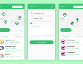
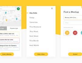
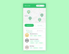
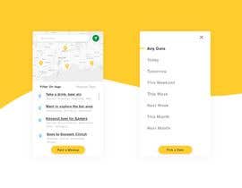
This is a page on an application that we want you to make suggestions on.
Want to make a modern design. This application window is for a Samsung S8. But the site will be in a responsive design. Have this in yor mind.
The best thing is if you can design the mookup program. Next job is to make all the other pages as well. But it's another job.

https://www.screencast.com/t/Ufa9KdgirM5Q

Recommended Skills

Employer Feedback

“@zakimubarakaziz won the contest on 21 January 2019”

Profile image Tonerweb, Norway.

Top entries from this contest

View More Entries

Public Clarification Board

  • Tonerweb
    Contest Holder
    • 5 years ago

    #6 by Willy A.
    Yes, thanks this is very good

    • 5 years ago
  • Tonerweb
    Contest Holder
    • 5 years ago

    #7 by Ahmad Z.
    Yes, thanks this is very good

    • 5 years ago
  • willyarisky
    willyarisky
    • 5 years ago

    please check #6

    • 5 years ago
  • Tonerweb
    Contest Holder
    • 5 years ago

    #5 by Ahmad Z.

    Yes this is much better and in the direction of what I'm looking for. Dont think we need this text, because they will understand "Any date"which is right next door - Cool idea to also insert Icon- Because it can easy tell more about the meeting people. If its sample only a meetup for girls, Icon of girl etc. https://www.screencast.com/t/fXD67uRy6zG

    • 5 years ago
    1. zakimubarakaziz
      zakimubarakaziz
      • 5 years ago

      thank you for your feedback, please wait for the update

      • 5 years ago
  • Tonerweb
    Contest Holder
    • 5 years ago

    #4 by James M
    Very good, one of the better ones.
    Like the frame and agree that scrollbar etc is superfluous.
    But you're missing function for filter on tags and Popular tags. Maybe a update icon in map for to save space. I also like the idea of insert icon as pin on map

    • 5 years ago
  • Tonerweb
    Contest Holder
    • 5 years ago

    #3 by Willy A.
    Thanks for the link.
    Very smart to have a update icon insted of using space for a Update button. Vert good: https://www.screencast.com/t/4W6rK7Fmo

    • 5 years ago
  • willyarisky
    willyarisky
    • 5 years ago

    Please Check #3

    • 5 years ago
  • willyarisky
    willyarisky
    • 5 years ago

    on progress

    • 5 years ago
  • Tonerweb
    Contest Holder
    • 5 years ago

    Clarification - about #2
    This is not what Iam looking for. It looks littlebit to boring and old out.

    I understand it's hard to make a nice design when there are no pictures. But I believe in a combination of some color shades and that it is a little round design and not very square will help

    • 5 years ago

Show more comments

How to get started with contests

  • Post your contest

    Post Your Contest Quick and easy

  • Get tons of entries

    Get Tons of Entries From around the world

  • Award the best entry

    Award the best entry Download the files - Easy!

Post a Contest Now or Join us Today!